Your Cart is Empty
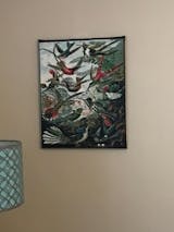
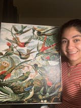
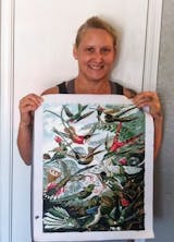
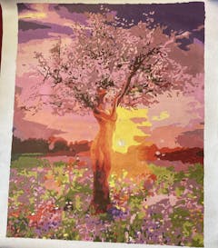
This is my 3rd custom painting. I love the paints that come with it. Never dry and always flow nicely onto the canvas. Great quality!
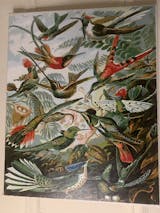
It is a beautiful paiting, but the combination numbers/colors were often very different from the original painting. That made it difficult for me to paint. I havn't finished it yet, some details still to be done,
It was relaxing to paint, not difficult so I added a few details looking at the original paiting.
![DIY Paint by Number kit for Adults on Canvas-[Ships from USA] Hummingbirds - Ernst Haeckel - 1904-Painting & Calligraphy](http://mypaintbynumbers.com/cdn/shop/products/diy-paint-by-number-kit-for-adults-on-canvas-hummingbirds-ernst-haeckel-1904-painting-calligraphy_34955b2f-99a7-4dff-ac4d-f660b4aedced_1200x.jpg?v=1641214997)


